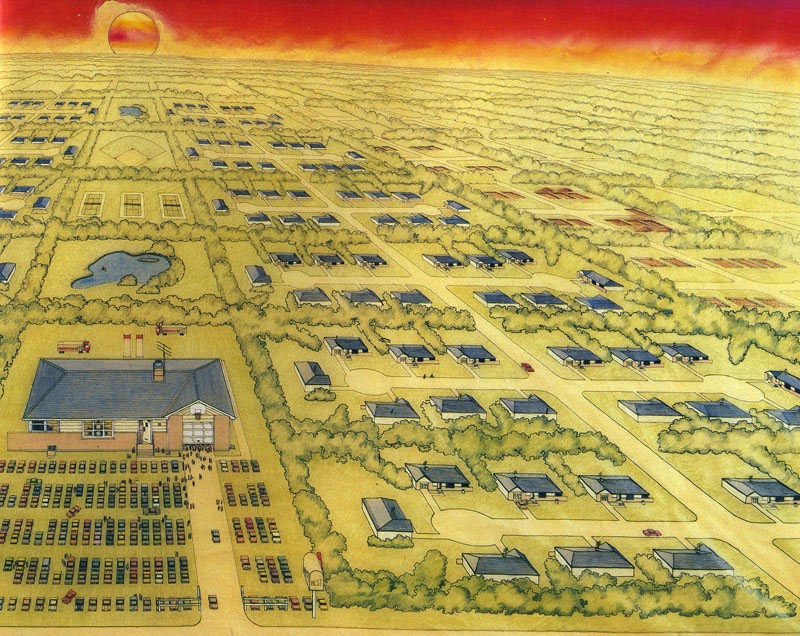
Mostrando entradas con la etiqueta cambio de escala. Mostrar todas las entradas

3.9.15

1988 L'evoluzione del freddo REX Edimuebles


¿Un frigorífico diseñado como el monolito de 2001?
Parece que sí... Hubo un tiempo en el que cualquier objeto asociado con el espacio doméstico era susceptible de convertirse ne una arquitectura en miniatura... el tiempo del CAMBIO DE ESCALA... la edad de los EDIMUEBLES!!!

4.12.14

1980 1982 New Editorial Domus Offices [Studio Nizzoli] BIZARRE COLUMNS XLI


Los italianos de Studio Nizzoli diseñaron la nueva sede de la revista Domus como si de una gran columna jónica se tratara...  una mezcla de Face-tecture y Bizarre Columns para esta columna regordeta con facciones de cara humana... BIZARRE COLUMNS!!!!!

21.11.14

1979 House in Pittsburgh [Venturi Scott-Brown] HIPERGRÁFICA


Interesante uso de una hipergráfica que deforma los elementos arquitectónicos con los que se entremezcla. Venturi y Scott-Brown expresan de esta forma sus intenciones:

"This is a small house for a compact, sloping, wooded site that you come upon suddenly and don’t ever see from a distance.

It’s a small building whose explicit surface ornament helps to give it a big scale, making of it a house and a pavilion.  At the time, its ornamental elements and expressionistic form were considered unusual." (Venturi, Scott-Brown)

6.11.14

1986 Projet d'aménagement de la Cour du Palais Royal à Paris [Daniel Buren] BIZARRE COLUMNS XXXVI


Mis respetos señor Buren… Interesante uso de una malla de columnas reducidas a sus fustes y con dimensiones distintas que generan todo tipo de juegos geométricos y usos imprevistos… Columnas que se convierten en asientos y otras que generan vistas más abiertas o cerradas en el paisaje urbano de la plaza… BIZARRE COLUMNS!!!

5.11.14

1980 1984 Les Arènes de Picasso [Manuel Nuñez Yanowsky] BIZARRE COLUMNS XXXV


Nuñez Yanowsky, socio incansable del Taller de Arquitectura de Ricardo Boffil se emancipó en los primeros ochenta y construyó, en un programa estatal en el que también participaba el propio Boffil, este edificio de viviendas sociales repleto de columnas bizarras… En este caso, dichas columnas megalómanas se convierten en los núcleos de comunicaciones y se rematan con una especie de pérgola a modo de capitel dórico, construyendo así las terrazas comunitarias del conjunto… el primer capitel de la historia de la arquitectura que sirve para tender la ropa dentro… BIZARRE COLUMNS!!!

31.10.14

1983 Rocky Restaurant [Sinya Okayama] LA MALLA DE SUPERSTUDIO


Que a frikis a los japoneses no les gana nadie… pues no es una novedad… que la malla homogénea de Superstudio tuvo una repercusión estética en la arquitectura japonesa de mediados de los setenta y principios de los ochenta… pues parece que no es tan evidente… En el diseño para el Rocky Retsaurant, Sinya Okayama la utiliza para revestir de manera homogénea el templete fake que nace de unas rocas artificiales y que sirve de cobertura al exuberante interior…

6.6.14

1985 Alessi Campidoglio Tray [Venturi + Scott Brown] CAMBIO DE ESCALA


A mediados de los 80 el cambio de escala estaba a la orden del día… y el Campidoglio era referencia a seguir… lo mismo te lo encontrabas en un viaje a Japón repetido a escala 1/1 en un edificio de Isozaki que comiendo en un restaurante caro, convertido en plato por Venturi y Scott-Brown… ah!!! Cambio de Escala!!!

3.6.14

1979 Kermesse Heroique [Dalí] CAMBIO DE ESCALA


La transferencia de referencias entre el arte y la arquitectura en referencia al cambio de escala fue total durante las décadas de los sesenta y setenta... En este caso Dalí trabajando en su gran retrospectiva inaugurada en Diciembre de 1979 en el Pompidou a partir de su Kermesse Heroique, una instalación en la que decenas de viandas, salchichas, fuets, longanizas o chorizos criollos incorporan la escala "colosal" a la muestra... cambio de escala...

9.5.14

1978 1983 Espaces d'Abraxas [Ricardo Bofill] BIZARRE COLUMNS XXXII


"A new idea in classicism is evident here. Previous constructional elements -column, entablature, capital- are now amplified in scale, divorced from their former roles and given new ones. The result is surreal, as one would expect, and frightening, due to the Pironesian scale. Some of the detail, such as the end pilasters, is outrageously thin appliqué. This scheme, and Bofill's Arcades du Lac, has thus received its share of censure and contempt - the annoyance which attends a new idea with radical implications. What is the scheme proposing?"

(Jencks, 1982, p.42)


Jencks, Charles (guest editor): AD Profile Free Style Classicism, 1982, p.42.

16.4.14

1980 1981 The Great American Cemetery [Stanley Tigerman] CAMBIO DE ESCALA


Stanley Tigerman se pregunta en este proyecto ¿Por qué los cementerios americanos se pueblan de referentes arquitectónicos europeos?

La tradición griega y romana se apodera de los cementerios de Estados Unidos por lo que Tigerman propone un futuro del cementerio americano como representación de su arquitectura del día a día... con tumbas coronadas por las viviendas en miniatura de los suburbios o los grandes rascacielos de los downtown que pueblan toda norte-américa...

28.3.14

1979 1980 "The Best Home of All" [Stanley Tigerman] Buildings for BEST Products Exhibition.


"Since World War II (an unbelievable 35 years ago) the United States of America has quietly been nurturing a typological evolution as homespun as John Wayne- the suburban house. The objecthood of this form is as solidly as Frank Lloyd Wright- embracing the hip roof (replete with overhangs), the corner window and the wing wall (both of which represent vestiges of Wright's breakup of the square, symmetrically axial, 19th-century aristocratic European box).
Now the suburban house has an identity of scale as solidly real as the brick. By now, almost the entire recent generation-come-of-age has experienced the suburban context -the Hilberseimer Tee-Plan brought into being in all of this continent's Levittised environments. Iconographically, the suburban house is as American as television (God knows, all its aerial search-and-sweep the sky like so many centipedal antennae). Only one very small, alien elements cloud the otherwise clear azure dome over suburban America -the uneuphemized, uncleansed, naked capitalist without any emperor's clothes at all- the commercial strip shopping center.
And so it was that the Best search for a new home began. Really, they just had to find a comfortable place - one that could kind of nuzzle up to its little friends, so that when they came out to shop it would be as if they had never left home. If they drove to the store, why, they could just park their car right on the front lawn. The Best mailbox would be just like their very own, only four times as big. The garage door would be partially open, just like their own broken one, and the front door would be invitingly open as well, revealing an American-dream-come-true-at-last... A 22' tall beckoning fair one as American and as wonderfully wholesome as Mary Tyler Moore. From the highway, their Best new home would settle contextual arguments once and for all, and you would never even really notice that each front step was 32' high, that the  front door was 12' wide x 26' 8'' high, that the downspots were 16" in diameter, that each brick was 15" high x 32" long (with 1 1/2" mortar joints), and that you would walk right by the areawell-as-bench right into the basement window-as-door.
Nearly the Best part of all was the four seasons. Halloween would feature a 10' black cat peering from behind the draped living-room window, with 20' corn shocks on the lawn and a grinning 8' jack-o'-lantern sitting right there on the front stoop.
At Christmas time 16" lights would be strung around the picture window revealing a 25' Christmas tree - and on the roof, a 25' Santa, sleigh, and reinderr. Easter would find 4' tall bunny-rabbits hopping up and down on the lawn searching for colorful 12" Easter eggs hidden between cars. But the Best season of all would be the Fourth of July. A 24' American flag would join the rest of the neighboring flags in celebrating America's birthday. Red and white stripped bunting would surround the garage door, and a 16' wide x 32' long x 10' high picnic table would be found at rest in the driveway, with a 12' high Weber grill nearby.
Of course, the very Best thing about their home lay in its neighborliness, insofar as they had finally found an American symbol right ther where they least expected it - at home in the suburban United States of America - and all the snotty bastards in the urban United States were simply green with envy."


Tigerman, Stanley: "The Best Home of All" en: "Buildings for Best Products", Museum of Modern Art, New York, 1979, p.22-25.

7.3.14

1977 BEST Products Notch Showroom. Sacramento, California [SITE Architects]


"A 1977 project in Sacramento, called the Notch showroom, continued SITE's use of fragmentation and subtraction. As James Wines describes it: The basic showroom prototype remains unchanged again using architecture as the subject matter or raw material of art, rather than the objective of a design process. In this case the building is penetrated by a 14' high raw-edge notch which serves as a main entranceway. The 45-ton wedge extracted from this gap is mounted on a rail system incised into the paving and mechanized to move a distance of 40' to open and close the showroom. Understandably, crowds of spectators assemble to watch the morning opening and evening closing "
(Arthur Drexler, 1979, p.10)


Drexler, Arthur: "Introduction" en: "Buildings for Best Products", Museum of Modern Art, New York, 1979, p.10.

5.3.14

1975 BEST Products Indeterminate Facade Showroom. Houston, Texas [SITE Architects]


"The next project, a showroom in Houston completed in 1975, was rather more drastic. James Wines, one of the principals of SITE, describes the concept involved as the de-architecturization of the facade and side walls. This has been achieved by extending the brick veneer arbitrarily beyond the logical edge of the roofline, resulting in the appearance of architecture somewhere between construction and demolition. To intensify this ambiguity, a section of the central facade has been fragmented and the waste bricks allowed to spill over the top of the pedestrian canopy "
(Arthur Drexler, 1979, p.10)

Drexler, Arthur: "Introduction" en: "Buildings for Best Products", Museum of Modern Art, New York, 1979, p.10.

4.3.14

BUILDINGS FOR BEST PRODUCTS. La Maravillosa historia de los almacenes norteamericanos BEST Products y la arquitectura


Hace poco me llegó un fantástico libro sobre la exposición del MOMA (del 13 de Diciembre de 1979 al 10 de Febrero de 1980) sobre la estrecha relación de los almacenes BEST con la arquitectura norteamericana de finales de los setenta, y en su defecto con varios de los "postmodernos" irónicos más célebres... Dicha relación empezó en 1972 con hasta nueves edificios diseñados y construidos por los SITE Architects comandados por James Wines (algunos ya posteados en Arqueología del Futuro ) y contó también con un edificio de Venturi y Scott-Brown   y una sede en Richmond diseñada a finales de los setenta por Hardy Holzman y Pfeiffer... Aparte de estos ejemplos construidos, la exposición, comisariada por Arthur Drexler bajo la proposición de Philip Johnson (quién si no!!!)  pidió nuevos diseños para Best a seis arquitectos norteamericanos ya incipientes en esos últimos setenta: Charles Moore, Stanley Tigerman, Allan Greenberg, Robert M. A. Stern, Michael Graves y Anthony Lumsden... Sobre todo ello escribiré en los próximos posts... en una mezcla de estrategias de Hipergráfica, Cambio de Escala y Perversiones Naturales... Larga vida a los ya desaparecidos almacenes BEST!!!!

Aquí unos enlaces al documental sobre los Best Products Showrroms disñeado spor SITE!!!

17.2.14

1973 Bestiario Funcional [Les Lalannes] PERVERSIONES NATURALES


Les Lalannes defiende su "Bestiario Funcional" como proyecto de cambio del "aburrido" paisaje doméstico contemporáneo. A través de una vuelta al siglo XVII, y a esos muebles con cabezas de leones o patas de vaca, la pareja de artistas franceses dulcifica esta idea de híbridos entre mobiliario funcional y animales salvajes para diseñar su "monstruos" o "Bestias Domésticas"... Una bañera Rinoceronte pintada de azul, un pollito butaca gigante de mimbre o un sofá de lata de sardinas, dónde los propios pescados se transforman en cojines gigantes...

16.2.14

1978 2-4-6-8 House [Thom Mayne & Michael Rotondi] HIPERGRÁFICA


Con la reducción de las ventanas a elementos de Hipergráfica, amarillo para la carpintería de la ventana exagerada y elementos superiores azules y rojos (que sirven de elementos de ventilación) y el uso de cuatro tamaños de las mismas, Thom Mayne y Michael Rotondi, dos de los enfant terribles californianos resuelven la relación exterior-interior de esta vivienda diáfana en su piso superior... Los distintos tamaños de las ventanas homólogas permiten varias funciones, desde la conversión de la mayor en un balcón, a la optimización de la ventilación cruzada por el tamaño tan distinto de las mismas... ¿¿¿Hipergráfica funcionalista????


12.2.14

1977 Edificio IBM a Milano [UNIARCH] HIPERGRÁFICA


La estrategia utilizada por UNIARCH para esta ampliación de la sede de IBM en Milán es potente y sencilla a la vez... utilizan las necesarias escaleras de incendio de este edificio administrativo para convertirlas en elemento principal de la fachada mediante una explosión de color al utilizar un rojo intenso para convertirlas en elementos albinos del frente a la carretera del complejo...  

11.2.14

1979 BEST Products Catalog Showroom [Venturi + Scott-Brown] HIPERGRÁFICA


Y de nuevo Venturi y Scott-Brown, esta vez utilizando todo el frente de un showrrom de los famosos almacenes BEST como si de un gran Wallpaper se tratara...

"This catalog showroom is located in an area of vast parking lots and numerous crossroads surrounding a major shopping mall. It needed a design for the exterior of a standard mass produced building with no windows that would give it a noticeable presence and recognition in its difficult location. Working within the parameters of a steel frame structure with block infill, freestanding in a parking lot, we developed a decorative facade fabricated out of porcelain steel panels. Large abstract red and white flowers were chosen for their obvious appeal to the viewer, while the random “wallpaper” effect of the overall pattern in relation to the panel module and the edges of the building reinforced the two-dimensional graphic scale of the pattern. A standard repeat was used to minimize the screens in fabricating the panels.

The big “sign” on the low building are combined to great effect in this unusual project."

10.2.14

1976 BASCO Showroom [Venturi + Scott-Brown] / HIPERGRÁFICA


La Hipergráfica llevada al extremo por los dioses... Venturi y Scott-Brown trabajan con un bajo presupuesto para convertir un antíguo almacén en showroom visible desde la carretera... La memoria del proyecto lo clarifica todo:

"What do you do with a building that is 16 feet high and 1,100 feet long, with only two doors and no windows? In this project for a catalog department store chain, we were asked to “beautify” this building, a decrepit, abandoned 1950’s shopping mall. The budget and schedule were tight. The client wanted us to create a positive roadside presence for the building from the nearby major highway, a task made more difficult by its below-grade siting and distance from the road. The vast space of the parking lot coupled with the unrelieved banality of the architecture suggested a design of bold communication rather than one of subtle expression. Using a fresh manipulation of scale and color, we developed the store’s logo into evenly spaced, steel framed, aluminum sheathed letters, 34 feet high by four feet deep and used the building as a contrasting “backdrop.” These five monumental letters leap out to connect the driver to the store. The letters B-AS-C-O have become the architecture of the roadside landscape and as a result, a well-known landmark that has served the company well."

5.2.14

1983 Public Houses Northcome Melbourne [Norman Day] HIPERGRÁFICA


En este proyecto, el australiano Norman Day utiliza los estereotipos formales y tipológicos de esta típica calle de Melbourne para  re-configurarlos y mezclarlos con licencias de gráfica superpuestas a los mismos... Desde remates de la cubierta sobredimensionados mediante un cambio de color al uso de cromatismos fuertes para descomponer los sencillos volúmenes heredados de la tipología de vivienda social australiana de los suburbios residenciales... también es interesante su uso del color en elementos banales como los canalones o los pequeños toldos de protección solar... (palabras del autor eso sí!!)