28.3.14

1979 1980 "The Best Home of All" [Stanley Tigerman] Buildings for BEST Products Exhibition.


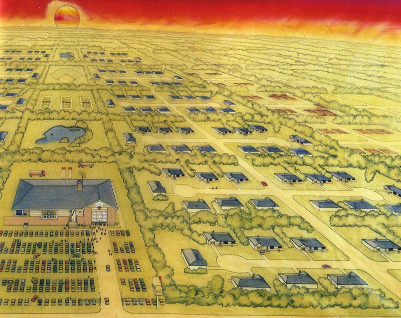
"Since World War II (an unbelievable 35 years ago) the United States of America has quietly been nurturing a typological evolution as homespun as John Wayne- the suburban house. The objecthood of this form is as solidly as Frank Lloyd Wright- embracing the hip roof (replete with overhangs), the corner window and the wing wall (both of which represent vestiges of Wright's breakup of the square, symmetrically axial, 19th-century aristocratic European box).
Now the suburban house has an identity of scale as solidly real as the brick. By now, almost the entire recent generation-come-of-age has experienced the suburban context -the Hilberseimer Tee-Plan brought into being in all of this continent's Levittised environments. Iconographically, the suburban house is as American as television (God knows, all its aerial search-and-sweep the sky like so many centipedal antennae). Only one very small, alien elements cloud the otherwise clear azure dome over suburban America -the uneuphemized, uncleansed, naked capitalist without any emperor's clothes at all- the commercial strip shopping center.
And so it was that the Best search for a new home began. Really, they just had to find a comfortable place - one that could kind of nuzzle up to its little friends, so that when they came out to shop it would be as if they had never left home. If they drove to the store, why, they could just park their car right on the front lawn. The Best mailbox would be just like their very own, only four times as big. The garage door would be partially open, just like their own broken one, and the front door would be invitingly open as well, revealing an American-dream-come-true-at-last... A 22' tall beckoning fair one as American and as wonderfully wholesome as Mary Tyler Moore. From the highway, their Best new home would settle contextual arguments once and for all, and you would never even really notice that each front step was 32' high, that the  front door was 12' wide x 26' 8'' high, that the downspots were 16" in diameter, that each brick was 15" high x 32" long (with 1 1/2" mortar joints), and that you would walk right by the areawell-as-bench right into the basement window-as-door.
Nearly the Best part of all was the four seasons. Halloween would feature a 10' black cat peering from behind the draped living-room window, with 20' corn shocks on the lawn and a grinning 8' jack-o'-lantern sitting right there on the front stoop.
At Christmas time 16" lights would be strung around the picture window revealing a 25' Christmas tree - and on the roof, a 25' Santa, sleigh, and reinderr. Easter would find 4' tall bunny-rabbits hopping up and down on the lawn searching for colorful 12" Easter eggs hidden between cars. But the Best season of all would be the Fourth of July. A 24' American flag would join the rest of the neighboring flags in celebrating America's birthday. Red and white stripped bunting would surround the garage door, and a 16' wide x 32' long x 10' high picnic table would be found at rest in the driveway, with a 12' high Weber grill nearby.
Of course, the very Best thing about their home lay in its neighborliness, insofar as they had finally found an American symbol right ther where they least expected it - at home in the suburban United States of America - and all the snotty bastards in the urban United States were simply green with envy."


Tigerman, Stanley: "The Best Home of All" en: "Buildings for Best Products", Museum of Modern Art, New York, 1979, p.22-25.

27.3.14

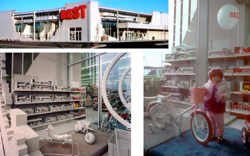
1984 Best Products Inside Outside Building Milwaukee [SITE Architects]


El último de los almacenes BEST tuneados por SITE llevará hasta las últimas consecuencias la idea de demolición del edificio. Como si de una debacle zombi se tratara, el edificio aparece como semi-derruido, enfatizando incluso las partes desoladas con zonas interiores que han quedado al exterior, con productos y mobiliario del edificio cubiertos de cemento en esas zonas interiores / exteriorizadas... una estrategia que ya habían utilizado en el diseño de alguna tienda o en instalaciones esculturales al aire libre... Y aquí termina la historia de amor entre los almacenes BEST y los bizarros SITE Architects de James Wines!!!!

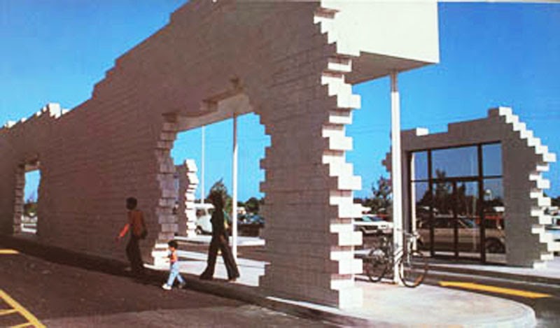
1979 BEST Products Cutler Ridge Showroom [SITE Architects]


Penúltimo de los almacenes de BEST tuneados por los bizarros SITE. En este caso dejan las perversiones naturales para volver a su plan de destrucción mundial... Los americanos van substrayendo partes de la fachada y colocándolos a unos metros de separación de la misma de manera gradual... primero un gran muro al que quitan y separan la zona de la marquesina, a la que quitan y separan las puertas de entrada...

21.3.14

1978 Best Products Tilt Showroom Eudowood Mall Maryland [SITE Architects]


Interesante propuesta para generar una espectacular entrada de otro de los edificios BEST de SITE... separando el muro de fachada y girándolo por uno de sus lados se consigue que la entrada al edificio sea como levantar una caja de zapatos y poder entrar en ella... La vista desde la carretera es también una espectacular carta de presentación del edificio...

17.3.14

1978 BEST Products Forest Showroom. Richmond, Virginia [SITE Architects]


A pesar de que James Wines y sus SITE nunca llegaron a materializar su propuesta inicial para un Forest Building... testaron otra opción real para el mismo lugar que al final llegó a construirse... Rompiendo el edificio, una fila de árboles parece dividir los almacenes en dos... generando de esta manera una pintoresca entrada, una mezcla entre exterior e interior, que cambia de manera radical la imagen de BEST y supone un gran proyecto-ejemplo de hasta dónde se puede llegar en el mundo d elas Perversiones Naturales!!!!

12.3.14

1978 BEST Products Anti-Sign Showroom [SITE Architects]


Después de varios experimentos de deconstrucción y re-naturalización de los almacenes BEST, SITE trata en este proyecto de trabajar con la barata y sencilla Hipergráfica aunque de una manera disuasoria... Su anti-señal no es más que una disolución progresiva del nombre de la marca, que aumenta su escala pasando de ser un logo y slogan comprensible a una situación caótica al ir disminuyendo poco a poco la distancia entre letras, generando así superposiciones enfatizadas con las distintas transparencias de la pintura... un efecto sin duda impactante en la aproximación desde el coche al edificio, en la que la velocidad ya genera situaciones parecidas por si misma... BEST BEST BEST!!!!

11.3.14

1978 Best Products FOREST BUILDING Richmond Virginia [SITE Architects]


La construcción de estos grandes almacenes estaba prevista en un espacio suburbano ocupado por un denso bosque a uno de los lados de la carretera. SITE intenta invertir la situación generando un edificio que parece invadido por el bosque y no al revés. A él pertenece esta icónica imagen (recuperada con mucho acierto en un segundo premio(lástima) del concurso para el Mercado de Sanchinarro) de perversión natural de entrada a un bosque que resulta ser otro de los supermercados BEST.

8.3.14

1978/79 BEST Products HIALEAH SHOWROOM. 5301 West 20th Avenue, Hialeah, Miami [SITE Architects]


En este caso SITE generan en la fachada del edificio un microcosmos de la vida vegetal de Miami con palmeras, arean y roca entre un cerramiento de cristal y la estructura de ladrillos del interior a modo de min-invernadero con el que la fachada del edificio se convierte en el reflejo de algo que no existe, ya que está flanqueada por edificios y un gran aparcamiento justo enfrente. Me llama la atención como con este efecto SITE consiguen transformar el entorno del edificio en un lugar paradisíaco al parecer la vegetación interior parte del reflejo de la fachada.

7.3.14

1977 BEST Products Notch Showroom. Sacramento, California [SITE Architects]


"A 1977 project in Sacramento, called the Notch showroom, continued SITE's use of fragmentation and subtraction. As James Wines describes it: The basic showroom prototype remains unchanged again using architecture as the subject matter or raw material of art, rather than the objective of a design process. In this case the building is penetrated by a 14' high raw-edge notch which serves as a main entranceway. The 45-ton wedge extracted from this gap is mounted on a rail system incised into the paving and mechanized to move a distance of 40' to open and close the showroom. Understandably, crowds of spectators assemble to watch the morning opening and evening closing "
(Arthur Drexler, 1979, p.10)


Drexler, Arthur: "Introduction" en: "Buildings for Best Products", Museum of Modern Art, New York, 1979, p.10.

6.3.14

1976 BEST Products Parking Lot Building Los Angeles [SITE Architects]


En su proyecto para el showroom de BEST en Los Ángeles, SITE darán un giro radical en relación a sus dos anteriores intervenciones. Esta vez trabajan con el volumen general de la caja cerrada que supone el "standard" de los almacenes BEST para convertirlo en una topografía sinuosa como continuación del asfalto y pintura del parking existente, elemento fundamental en cada uno de estos almacenes. De esta manera SITE no sólo enfatizan dicho aparcamiento sino que lo convierten en imagen principal del conjunto al prolongarlo como cubierta del nuevo edificio.

5.3.14

1975 BEST Products Indeterminate Facade Showroom. Houston, Texas [SITE Architects]


"The next project, a showroom in Houston completed in 1975, was rather more drastic. James Wines, one of the principals of SITE, describes the concept involved as the de-architecturization of the facade and side walls. This has been achieved by extending the brick veneer arbitrarily beyond the logical edge of the roofline, resulting in the appearance of architecture somewhere between construction and demolition. To intensify this ambiguity, a section of the central facade has been fragmented and the waste bricks allowed to spill over the top of the pedestrian canopy "
(Arthur Drexler, 1979, p.10)

Drexler, Arthur: "Introduction" en: "Buildings for Best Products", Museum of Modern Art, New York, 1979, p.10.

4.3.14

1972 BEST Products Peeling Showroom. Richmond, Virginia [SITE Architects]


"SITE's first project for BEST, in 1972, was not a new building but simply an alteration of an existing one. SITE added a veneer of brick to make a wall that looks as if it is peeling away from the building. This modest intervention removes the building from the real of anonymity without introducing questions of architectural design. Instead it undermines the logic of the building with a modification that implies ultimate destruction"
(Arthur Drexler, 1979, p.8-10)

Drexler, Arthur: "Introduction" en: "Buildings for Best Products", Museum of Modern Art, New York, 1979, pp.8-10.

BUILDINGS FOR BEST PRODUCTS. La Maravillosa historia de los almacenes norteamericanos BEST Products y la arquitectura


Hace poco me llegó un fantástico libro sobre la exposición del MOMA (del 13 de Diciembre de 1979 al 10 de Febrero de 1980) sobre la estrecha relación de los almacenes BEST con la arquitectura norteamericana de finales de los setenta, y en su defecto con varios de los "postmodernos" irónicos más célebres... Dicha relación empezó en 1972 con hasta nueves edificios diseñados y construidos por los SITE Architects comandados por James Wines (algunos ya posteados en Arqueología del Futuro ) y contó también con un edificio de Venturi y Scott-Brown   y una sede en Richmond diseñada a finales de los setenta por Hardy Holzman y Pfeiffer... Aparte de estos ejemplos construidos, la exposición, comisariada por Arthur Drexler bajo la proposición de Philip Johnson (quién si no!!!)  pidió nuevos diseños para Best a seis arquitectos norteamericanos ya incipientes en esos últimos setenta: Charles Moore, Stanley Tigerman, Allan Greenberg, Robert M. A. Stern, Michael Graves y Anthony Lumsden... Sobre todo ello escribiré en los próximos posts... en una mezcla de estrategias de Hipergráfica, Cambio de Escala y Perversiones Naturales... Larga vida a los ya desaparecidos almacenes BEST!!!!

Aquí unos enlaces al documental sobre los Best Products Showrroms disñeado spor SITE!!!